Tuesday, 3 May 2016
Monday, 2 May 2016
Evaluation 4
Throughout this whole short film making project I used a vast range of technology and software that all had an important role on the development of my final product. Firstly and crucially I chose to present all my work of internet blogging site blogger.

Blogger is a reliable, easy blog publishing service that easily allows me to make a text post, display images, embed PowerPoints and present Youtube/Vimeo clips all in one place. I already have great experience with Blogger following my AS project. Blogger allowed me to show the journey i took in the production of my film, from the early research to the final editing process.
For my target audience testings and reviews i used a variety of methods. Firstly i wrote a series of questions on Blogger and recorded using a simple flip camera my audience's response, then publishing the clip on Blogger. I also used Facebook messenger to directly contact individual members of my target audience to get a more direct and personal response from them. I also used traditional methods such as printing out and handing out questionnaires to my target audience and doing a simple tally of the results. However for presenting the results i used Inforgram. Inforgram is a simple to use, free information presenting software that allowed me to present my target audience test results in a more aesthetically pleasing way.

When it came to the filming process we used a fairly simple amount of equipment. Firstly we used a Nikon D3200 DSLR.

From past experience with the camera in my AS project i know this camera is not to be underestimated. Although it may appear much, it is very reliable, easy to focus and maneuver. The lens can be swapped out for one with a more variable zoom which was very handy for long and establishing shots with minimal shake and easy focus, as you would expect with a photographer style camera. Most importantly though it is capable of recording footage at 1080p HD which makes it perfect for the quality footage we wished to capture. Although it is very capable of recording decent quality audio, for what we wanted we needed something more. For this we attached a HD quality recording boom mike, which we sometimes attached to the camera it'self or held up to the subject using a extendable boom pole, which came with a "dead cat" attachment to remove any wind distortion from the audio.

To be to keep our camera stead and our tracking shots smooth we used a stable and sturdy Hama tripod, which from our past experience we know to be sturdy, smooth to use and very portable. This enabled to take smooth panning shots and sturdy focused footage.

Throughout the whole editing process we stored and processed all of our footage on Apple IMac computers.

For the past year during our AS project we became very familiar with the high capability of IMacs and how they handle certain software and how to use their complex storage systems. More importantly IMacs have some of the most advanced and professional media software on any computers. It was these professional linear software we used to edit our footage.

Premiere Pro was the primary software we used to edit our film. Premiere Pro is prime example of technological convergence at it's best. Using this software we were able to do the continuity editing of our footage, edit the sound, lighting, contrast, speed and focus levels of our footage. It even allowed us to do a basic level of special effects. However for the sake of our film we primarily used it for the continuity editing of our film, for which Premiere Pro's easy clip importing and refining capabilities made the task very simple and flexible. It's frame by frame clip cutting tool allowed to have very refined and precise footage that fitted together into a linear sequence.

However for the more advanced special effects which we included in our film we used After Effects.

Adobe After Effects is a digital visual effects, motion graphics, and compositing software, which allowed us to create the professional standard special effects we used in our film. However I had little knowledge of how to use this complex software so for the majority of effects we used I followed a YouTube tutorials which gave step by step guides on how to create a desired effect. After Effects enabled us through complex motion tracking and fixating to create very compelling and exciting effects such as the car crash and gunshot scenes in our film. These edited clips were then easily transferred to Premiere Pro to be added to the finished sequence. For the our incidental and score soundtracks we used Garage band.

Garage Band is a simple Apple software which enables the composition of MP3 music files which can then be uploaded to Apple music and then onto our finished sequence. I previously had some experience with garage band when i created the Score sound track for my AS film. It's a very simple software that allows you access to a variety of instruments and audios that can be sequenced together one at a time into a finished composition. We used this for our score in our title sequence.

Another software we briefly touched upon was Adobe Audition.

Audition is a digital audio workshop software which allows you to edit, in detail a piece of audio. This was my first time using this software so i had to spend time getting to grips with the basics. I used audition to edit the wavelengths, echo and distortion of specific clips to give them a dramatic effect for our film, for example the sound effect that can be heard when our protagonist time travels.
After using all this advanced software to piece together our final product we then posted it on YouTube.

YouTube is the most popular video sharing application in the world. It allows you to share media footage in HD online to the whole world. However we used YouTube as it is the most compatible and easiest site to share and upload footage onto different browsers, for example Blogger. All out our preliminary clips and recorded target audience tests were put onto YouTube.
Finally for the entire development and creation period of our ancillary products we used Photoshop.

Photoshop is one of the most advanced and professional photo manipulation software available. For my ancillary product I used Photoshop for everything, the enhancing of my images, the setting of the layout and the creation of our typography. I have been using Photoshop for a number of years, In my AS course i used it to create the Ident for our previous film.

Blogger is a reliable, easy blog publishing service that easily allows me to make a text post, display images, embed PowerPoints and present Youtube/Vimeo clips all in one place. I already have great experience with Blogger following my AS project. Blogger allowed me to show the journey i took in the production of my film, from the early research to the final editing process.
For my target audience testings and reviews i used a variety of methods. Firstly i wrote a series of questions on Blogger and recorded using a simple flip camera my audience's response, then publishing the clip on Blogger. I also used Facebook messenger to directly contact individual members of my target audience to get a more direct and personal response from them. I also used traditional methods such as printing out and handing out questionnaires to my target audience and doing a simple tally of the results. However for presenting the results i used Inforgram. Inforgram is a simple to use, free information presenting software that allowed me to present my target audience test results in a more aesthetically pleasing way.

When it came to the filming process we used a fairly simple amount of equipment. Firstly we used a Nikon D3200 DSLR.

From past experience with the camera in my AS project i know this camera is not to be underestimated. Although it may appear much, it is very reliable, easy to focus and maneuver. The lens can be swapped out for one with a more variable zoom which was very handy for long and establishing shots with minimal shake and easy focus, as you would expect with a photographer style camera. Most importantly though it is capable of recording footage at 1080p HD which makes it perfect for the quality footage we wished to capture. Although it is very capable of recording decent quality audio, for what we wanted we needed something more. For this we attached a HD quality recording boom mike, which we sometimes attached to the camera it'self or held up to the subject using a extendable boom pole, which came with a "dead cat" attachment to remove any wind distortion from the audio.

To be to keep our camera stead and our tracking shots smooth we used a stable and sturdy Hama tripod, which from our past experience we know to be sturdy, smooth to use and very portable. This enabled to take smooth panning shots and sturdy focused footage.

Throughout the whole editing process we stored and processed all of our footage on Apple IMac computers.

For the past year during our AS project we became very familiar with the high capability of IMacs and how they handle certain software and how to use their complex storage systems. More importantly IMacs have some of the most advanced and professional media software on any computers. It was these professional linear software we used to edit our footage.

Premiere Pro was the primary software we used to edit our film. Premiere Pro is prime example of technological convergence at it's best. Using this software we were able to do the continuity editing of our footage, edit the sound, lighting, contrast, speed and focus levels of our footage. It even allowed us to do a basic level of special effects. However for the sake of our film we primarily used it for the continuity editing of our film, for which Premiere Pro's easy clip importing and refining capabilities made the task very simple and flexible. It's frame by frame clip cutting tool allowed to have very refined and precise footage that fitted together into a linear sequence.

However for the more advanced special effects which we included in our film we used After Effects.

Adobe After Effects is a digital visual effects, motion graphics, and compositing software, which allowed us to create the professional standard special effects we used in our film. However I had little knowledge of how to use this complex software so for the majority of effects we used I followed a YouTube tutorials which gave step by step guides on how to create a desired effect. After Effects enabled us through complex motion tracking and fixating to create very compelling and exciting effects such as the car crash and gunshot scenes in our film. These edited clips were then easily transferred to Premiere Pro to be added to the finished sequence. For the our incidental and score soundtracks we used Garage band.

Garage Band is a simple Apple software which enables the composition of MP3 music files which can then be uploaded to Apple music and then onto our finished sequence. I previously had some experience with garage band when i created the Score sound track for my AS film. It's a very simple software that allows you access to a variety of instruments and audios that can be sequenced together one at a time into a finished composition. We used this for our score in our title sequence.

Another software we briefly touched upon was Adobe Audition.

Audition is a digital audio workshop software which allows you to edit, in detail a piece of audio. This was my first time using this software so i had to spend time getting to grips with the basics. I used audition to edit the wavelengths, echo and distortion of specific clips to give them a dramatic effect for our film, for example the sound effect that can be heard when our protagonist time travels.
After using all this advanced software to piece together our final product we then posted it on YouTube.

YouTube is the most popular video sharing application in the world. It allows you to share media footage in HD online to the whole world. However we used YouTube as it is the most compatible and easiest site to share and upload footage onto different browsers, for example Blogger. All out our preliminary clips and recorded target audience tests were put onto YouTube.
Finally for the entire development and creation period of our ancillary products we used Photoshop.
Photoshop is one of the most advanced and professional photo manipulation software available. For my ancillary product I used Photoshop for everything, the enhancing of my images, the setting of the layout and the creation of our typography. I have been using Photoshop for a number of years, In my AS course i used it to create the Ident for our previous film.
Evaluation 3
After finishing my products I needed to gather my target audience feedback for both my short film and my ancillary products. I selected a group of 5 men and 5 women set at our target age of 15+ to help us establish which gender our film has the most appeal to, whilst also finding out if our film appealed to our target audience. I selectively chose the 10 people and communicated with them via social network. I showed them our film and then asked them a series of particular questions and recorded the results on Infogram, an online site which enables to me present information in a more unique and aesthetic way. We asked the following questions
:1. Did you enjoy the film?
2. Did you find the narrative easy to follow?
3. Did you enjoy our range of special effects?
4. Were you shocked by the plot twist?
5. Do you feel our film could of been longer/shorter?
6. Did you enjoy our title sequence?
7. Did you enjoy our sound tracks?
:1. Did you enjoy the film?
2. Did you find the narrative easy to follow?
3. Did you enjoy our range of special effects?
4. Were you shocked by the plot twist?
5. Do you feel our film could of been longer/shorter?
6. Did you enjoy our title sequence?
7. Did you enjoy our sound tracks?
This graph shows that an overwhelming majority of people enjoyed our film. This also shows there is a slight increase of men enjoying our film then women, although this is only one person so it can't be considered as a fact.
This received a more mixed results with more men having a overall better understanding of the storyline, although i'm unsure of why this is the case, perhaps it's just due to the personality of the males I chose. However more than 2/3rds of people understood the narrative, not a vast majority so perhaps it's clear that more work is needed to make our narrative more understandable.
All of our target audience enjoyed out special effects, this truly shows that the special effects we used are compelling and iconic and meet our target audiences standards.
The results for this were quite negative. it appears the majority of people either were only partially shocked by the plot twist or not at all. In terms of gender males were more shocked by the plot twist. This could be because they did not fully understand the plot twist and maybe we need to highlight it more in the narrative.
The clear results of this poll is that the length of our film is just right, with only a minority suggesting otherwise. This minority for whatever reason comprises mainly of men.
It's clear by the results that our title sequence is good by our target audience's standards. Since it was chosen by our target audience this isn't too surprising.
A vast majority of people enjoyed our sound tracks. However the reasonable portion of people who said otherwise suggests perhaps a bit of tweaking is required to get our sound tracks up to the highest standard possible. In terms of gender it was fairly balanced with 1 more female not enjoying the soundtrack compared to men.
This next set of results is in regards to our ancillary products. Using the same software I used to present my previous results I asked 2 different sets of questions for my poster and magazines.
Poster questions:
1.Is this poster aesthetically pleasing?
2.Does it include too much or too little information?
3.Would this attract you to watch our film?
4.Do you like the colour styling?
Magazine questions;
1.Do you like the layout?
2.Is there too much or too little information?
3.Would this attract you to watch our film?
4.Do you like the imagery?
3.Would this attract you to watch our film?
4.Do you like the imagery?
The results of my poster questionnaire is positive overall. Only a minor amount of negative feedback that doesn't effect the overall result. My target audience clearly enjoyed my final poster. However the feedback for my magazine was overwhelmingly negative. Very few people liked the layout and very few said it would attract them to watch the film and many stated that it has too little information on it. With this feedback it's clear that my poster is the main product to concentrate on.
Sunday, 24 April 2016
Evaluation Question 2
For this project we created 3 products, our main 5 minute short film, a set of double page spread film reviews and a set of posters. We created a short 5 minute Sci-fi/thriller film with the theme of time travel, we created 2 ancillary products that were based around the themes, layout, mise-en-scene and colour scheme of our film.


The first ancillary product I created was this poster. Poster's are one of the most popular examples of heritage marketing and are one of the most common examples of push advertising. Posters are often used in a variety of ways:
-Being handed out as promotions
-Being presented on billboards
-Being featured in magazines
-Displayed in cinemas
-Sold as decoration
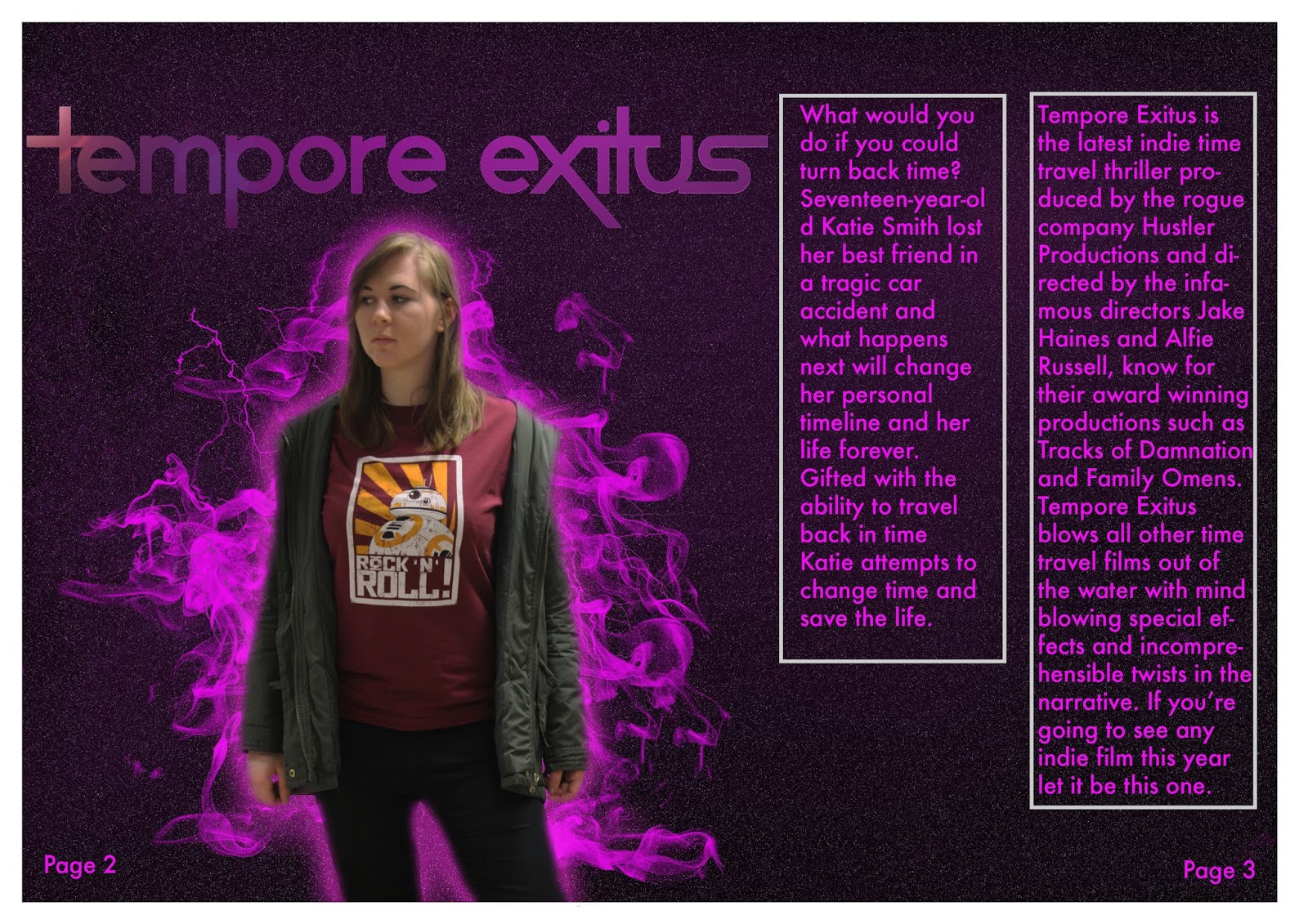
For a film poster to be effective it has to contain elements of the film its advertising, contain useful information and be visually appealing. In terms of our film poster we have considered all these key points and incorporated important elements from our film. Firstly we incorporated the title of our film displayed in our unique typography on our poster.

This typography and it's colour scheme are unique to our film. It is easily recognizable and identifiable to our target audience.The title on the poster is presented in a similar way to how it is in our film, in a dark background, in our colour scheme and with elements of our special effects presented within it.

The next key aspect of our poster that creates synergy between our film and the poster is our main protagonists face. Our protagonist's face is a key element of our film, her emotions, her thoughts and her actions are a key element of our film, so within our film we include numerous close ups, extreme close ups of her face, this makes it an icon of our film and makes her identifiable to our audience.


The other key element of our film that we incorporated into our poster was a unique part of our special effects. The special effects used in our film are by far the most exciting and unique selling point our film has to offer, in particular our time travelling effects of our protagonist. We have incorporated this unique time travelling effect that is used all throughout our film in our poster as it is recognizable to our audience and is and also makes the poster more visually spectacular.


The other ancillary product we produced was our 2 page magazine review. This included the same elements we incorporated into our poster, the special effects, our unique typography and our protagonist, all the things we used to create synergy with our short film. With out magazine we included a few more elements that link to our film.

We did feature was our character's costume. Now this has an interesting effect when combined with our visual effects that have been added with the edited image, it creates a firm juxtaposition between the casual, rather normal clothing of our protagonist and the mystifying unknown of the electric looking cloud of scientific looking smoke emitting around her. As I explained in my last evaluation question, it is more conventional in a time travel themed film for the protagonist to be dressed more casually often in a fashionable "In the times" outfit. This is definitely the case with the outfit our protagonist is wearing in this image.

Within the magazine I included this sceenshot from our film. This gives the reader a glimpse into the film. The image is ambiguous and doesn't reveal too much of the plot, this gives the audience a thirst to know more about the film and may encourage them to watch it.

One small detail we included that directly links to our film is this tagline.

The tagline "issues in time" directly links into both the title of our film and the narrative. Our title "Tempore Exitus" translates in Latin as "Time Issues". Also our film is revolved around the idea of trying to fix problems in the past through time travel, so including this phrase links it directly to our film and our genre theme.
Wednesday, 13 April 2016

Friday, 1 April 2016

Friday, 25 March 2016
Final poster

-added a tagline
-added an official BBFC rating
-enhanced the profile of the protagonist
-added my cast
-improved my title's brightness
Wednesday, 23 March 2016
Creating the poster
I used Adobe Photoshop to create my poster. Firstly using the cloud filter and some shading brushes. This created a galaxy effect which I would use for the background of all my posters. The purple shade used matches that of our typography and the galaxy idea links to our theme.
 I then added the pictures of our main characters. We took these pictures ourselves at a photo-shoot. I cropped these in, added an outer glow and feathered the edges so they fitted in the with background.
 Then using smoke and lightening effect tools i downloaded online, i added a smoke effect behind my characters to make it look like they are surrounded by a ghostly, sci-fi style mist.
 I then added in the title of our film using our typography which we decided before hand. I added it at the top then rendered a lighting effect to make it more visually appealing. I also added a simple lens flare to make it more dramatic.
 Finally I added all the information in text and it was finished.


Tuesday, 22 March 2016

Friday, 18 March 2016
Editing the film on Premiere Pro
Now with all our clips gathered after a long and endearing filming process, it is time to piece it together into the final compilation. For this i'm using Adobe Premiere Pro, an advanced and professional software on Macs. Premiere Pro allows me to edit, manipulate and perfect my clips. The main thing I will be using it for linear editing.
 I uploaded my clips onto my file area which allows me easy access to them, and enables me to easily drag them into the correct place. I then use the razor tool to cut the clip perfectly to remove any unnecessary footage before placing the clip into order.
 Some of our filming sessions were done at different times in the day, this means the lighting is different in some of our footage. Using the brightness and contrast tool on the effects area, I matched the lighting of the clips so they work together in one sequence.
 Another issue we used Premiere Pro to resolve was the sound levels. Some of our clips had uneven sound levels that needed balancing. Using the Volume tool I brought the sound level to a sensible level that makes the sound more comprehensible. I also used the pen tool to drop and raise the volume level in certain points where it wasn't balanced.


Tuesday, 15 March 2016
Magazine Plan 1

Sunday, 13 March 2016
Magazine analysis - Clash Of The Titans

This is a double page film review of Action, Adventure fantasy film Clash of the Titans by Empire magazine, who I have already established as one of the biggest and most popular British film magazine publishers. Clash Of The Titans is a film based on Greek mythology about the son of Zeus who must save the world by battling epic monsters and travelling far (fairly generic stuff for a fantasy film).
The film is based of ancient Greek mythology as such the spread is themed in an epic style with a fantasy look to it. The first part that stands out is the title of this review "Gods and Monsters" although this is not the title of the film the phrase sums up the narrative of the film, God and monsters being the two main aspects in the film. The typography it's styled in has a "Gothic" look to it, mixed in with a dark bronze colour which all links in with the fantasy genre and conventions. This style of text is also seen in the initial starting the paragraphs adding to the Gothic look of the review. Interestingly the word "God" is presented over the gloomy dark background, whilst the word "Monster" is presented over a clean white background, both words are incorporated with backgrounds that juxtapose their meanings. This might link to the narrative.

The picture of the left presents the main protagonist show at a long shot in which his mise en scene is very typical for something you'd expect to see in a mythological style fantasy action film. His costume consists of ancient antiquity battle armor with the muscle shaped torso and leg guards and vambraces, all things commonly associated with a Greek mythological hero. However the dark colours of it subvert this stereotype, you'd expect a "hero" figure to be wearing bright gilded colours to represent his heroism and good intentions, the dark of this man's armor present him as a different type of hero. He has two props, firstly a full sack. This is shown in the film poster to add a hint of mystery as the audience will question what it's contents are. In the other hand he's gripping an odd sort of scaly shield that would excite a fantasy fan as it associates with mythical beings like dragons.

There is a second image presented in the center of the spread, unlike the primary image this one is a still from the film and it hints to the audience a bit more of the narrative. In it you can see the protagonist sneaking around with a rather abnormal looking robed figure towering over him. The scene chosen creates more questions then answers for the audience and would encourage them to see the film. In the corner of the image there is a small description that reveals a piece of the narrative to tempt the audience.


Friday, 11 March 2016
Magazine Analysis - Skyfall

Skyfall was a modern instalment to the all time classic film franchise: James Bond. James Bond is the all time favourite action/thriller film featuring all the modern cliches you can expect to see in a spy film, fast cars, gadgets, over stereotypical woman in distress and an evil villain, all these cliches are set by the James Bond franchise and are highlighted by its booming success.Skyfall was the most successful Daniel Craig film and commemorates the 50th anniversary of the franchise. This is from Total Film magazine is a film magazine that breaks down films into specific areas and reviews them, such as dialogue, camera work etc.
The first thing that stands out in this spread is the tagline in the top right corner "Something old, Something new" this has two significant meanings, the first is it's reference to the new and smart looking Daniel Craig as the "something new" Craig being the face of the modern James Bond films. The "Something New" refers to the classic Aston Martin DB5, it is a very iconic and famous icon of the classic films and has been included in this film following the 50th anniversary. The tagline references to the juxtaposition between the two in the picture. the alternative meaning could be the reference to the old style classic films and the new reformed Daniel Craig films to celebrate the 50th anniversary.

There is actual little text in this part of the magazine I would imagine this is an intro page leading onto a larger article giving a more in depth review of the film. this double page spread is an intro. However next to the bulk of text there's a rather critical paragraph firstly describing the previous film "Quantum of Solace" as a "Critical Mauling, it then highlights the importance of this film to do well to keep the franchise alive.

the image displayed in a background covers the entire spread and the text is overlaid over the top of it. The key focus of the picture is Daniel Craig. His mise en scene matches that of the classic bond look. An expensive and smart looking suit, that is very well maintained and pristine, his suit is well pressed and his tie is well straightened despite all the intense action he's been involved in. His facial expression is unflinching with a cold calm to match his secretive and merciless personality. The second important part of the poster is the Aston Martin DB5. Any Bond fan will immediately recognise this and will find it quite nostalgic. The car matches the look of Bond, it's clean, sophisticated looking and sharp look, both a visually spectacular.
Subscribe to:
Posts (Atom)